
Ensodata Logo Refresh
A subtle exploration of refining a longstanding logo—this project is currently on hold, but it showcases a rigorous design process.
Their existing logo.
Ensodata wanted to keep changes to a minimum, but desired to refresh their logo, removing small elements; and updating it to be less clipart-like. The variations I presented held to their desired specifications while provided a variety of art styles and overall vibes.

Logo Concepts
These polished layout mockups were the final proposals presented to Ensodata’s co‑founders before the project was paused.
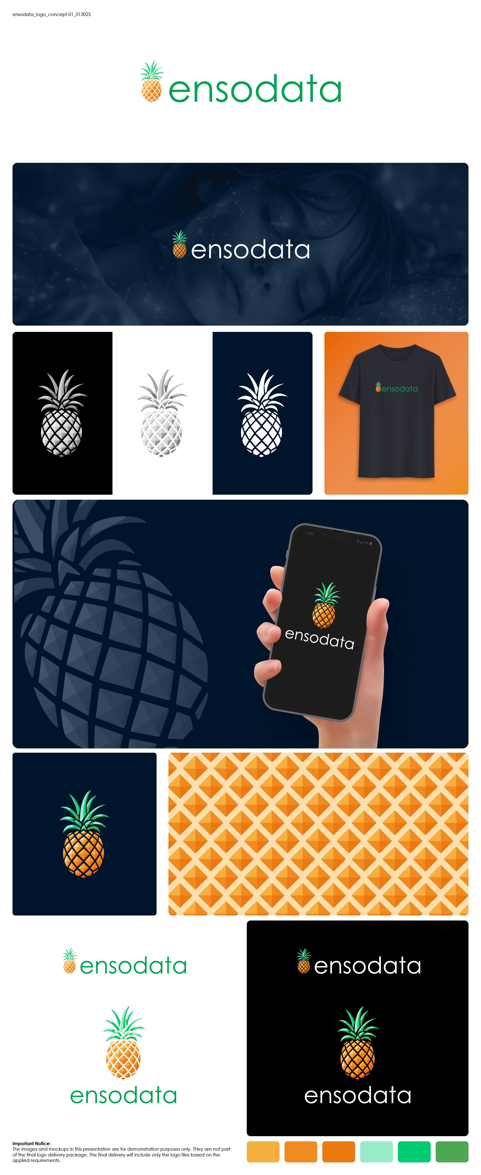
Concept 1

Concept 2
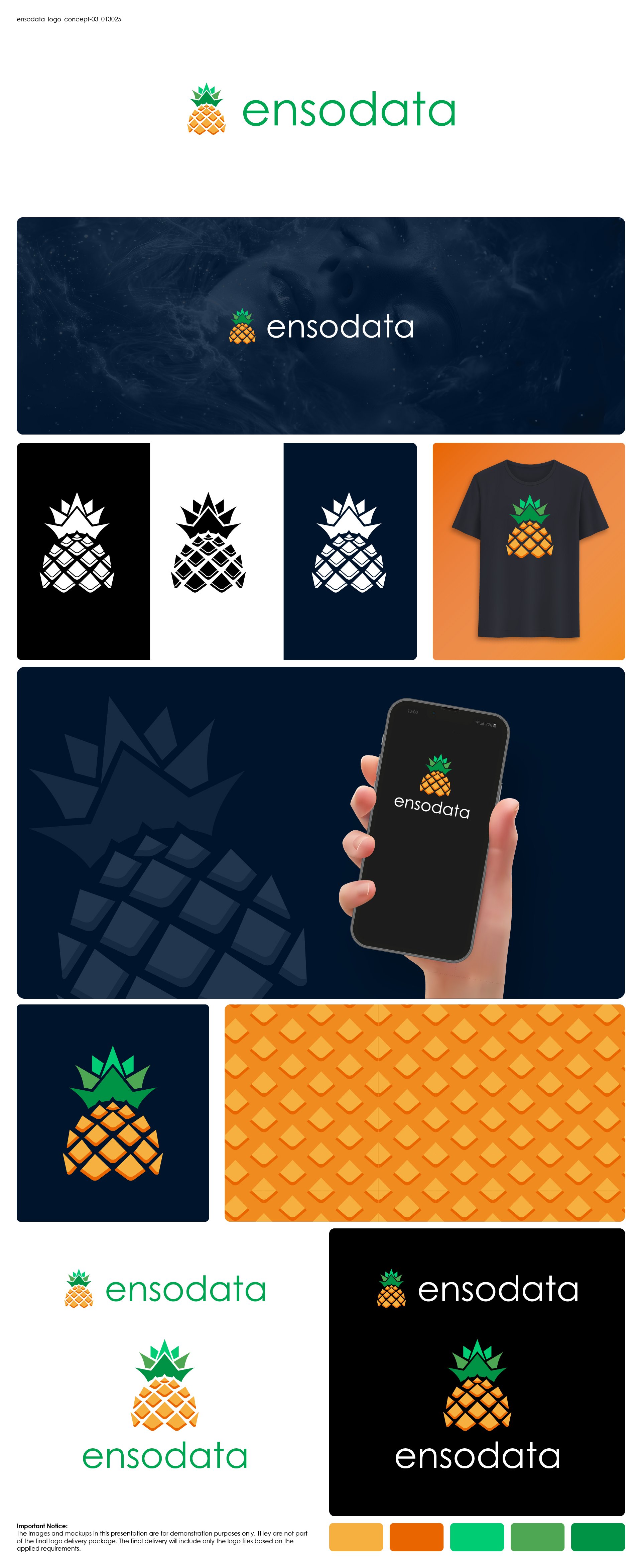
Concept 3
Key Impact
Modernized Look
Achieved a fresh, contemporary appearance while retaining the logo’s heritage.
Refined Glyph
Enhanced the leaves and body to reduce the clip‑art look.
Balanced Proportions
Adjusted the pineapple height for improved visual harmony with the word mark.
Brand Consistency
Maintained the established font and overall style to honor brand heritage.
Simplified Details
Removed extraneous elements (the white band) for a cleaner design.
Subtle Innovation
Introduced creative refinements that respect legacy while signaling modernization.