PTAM Brand Refresh – Modernizing a Trusted Financial Identity
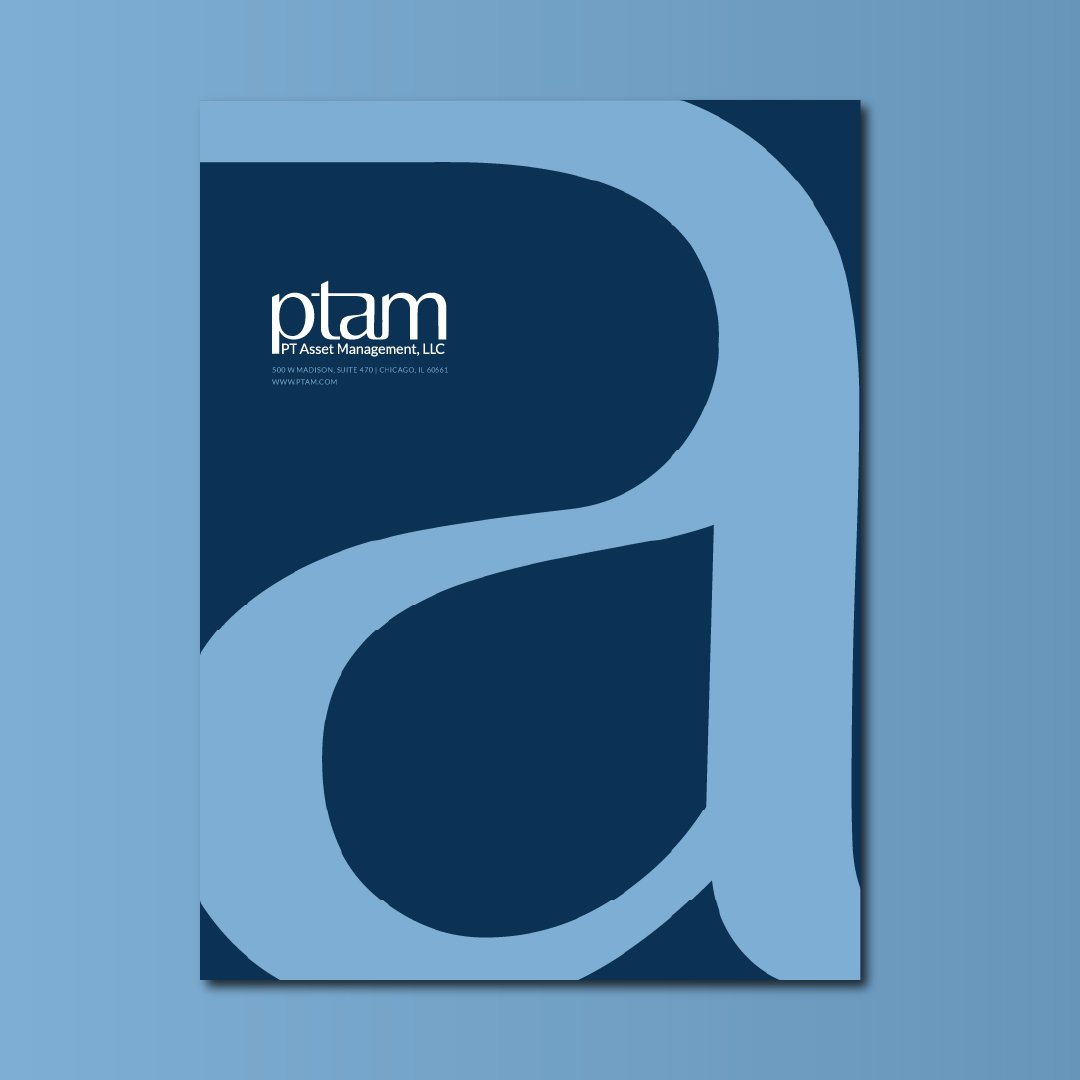
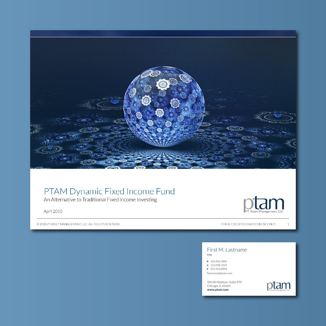
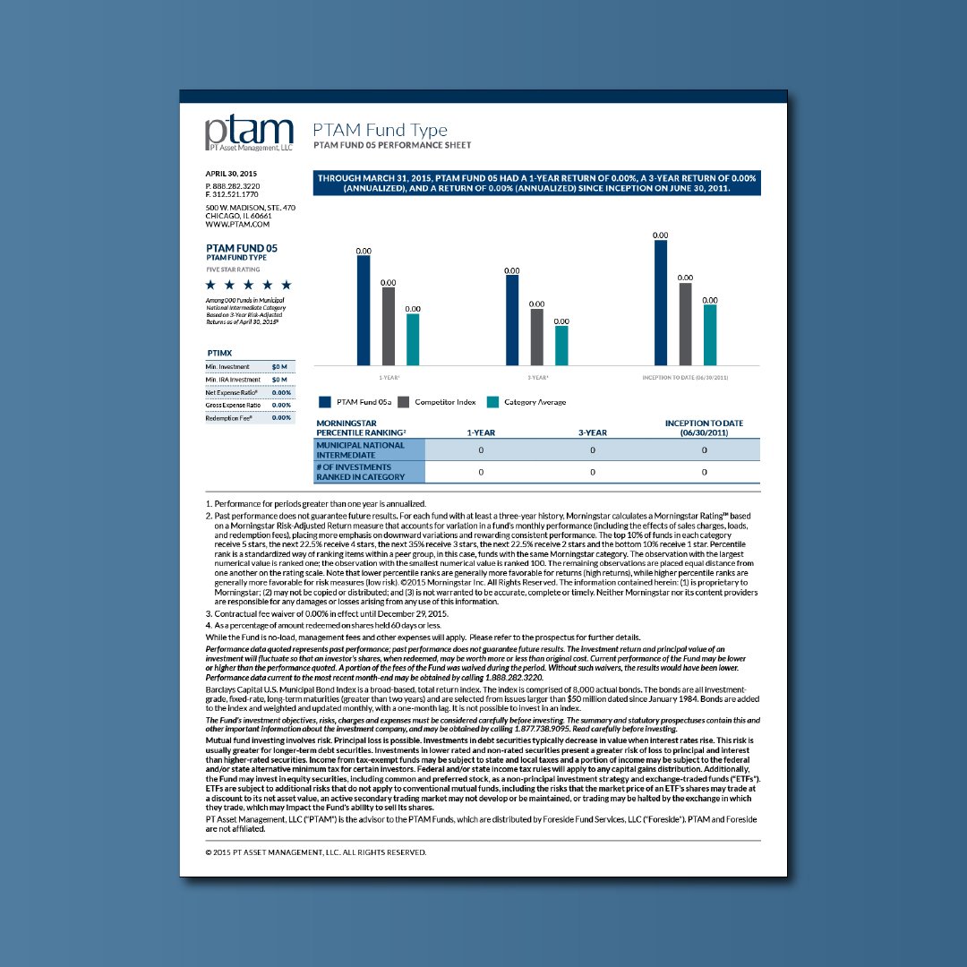
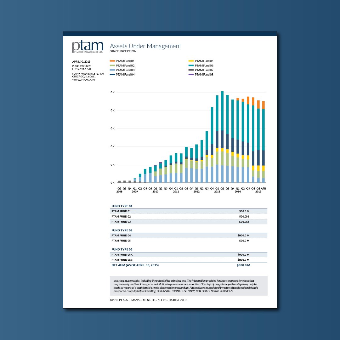
Revitalized PTAM’s visual identity to stand apart from its sister company and elevate the perception from a small shop to a large, successful financial institution.
Primary Logo
Glyph mark
Color Palette
Font
Lato Light (300)
A B C D E F G H I J K L M N O P Q R S T U V W X Y Z
a b c d e f g h i j k l m n o p q r s t u v w x y z
( 0 1 2 3 4 5 6 7 8 9 ! @ # $ % ^ & * )
Lato Regular (400)
A B C D E F G H I J K L M N O P Q R S T U V W X Y Z
a b c d e f g h i j k l m n o p q r s t u v w x y z
( 0 1 2 3 4 5 6 7 8 9 ! @ # $ % ^ & * )
Lato Bold (700)
A B C D E F G H I J K L M N O P Q R S T U V W X Y Z
a b c d e f g h i j k l m n o p q r s t u v w x y z
( 0 1 2 3 4 5 6 7 8 9 ! @ # $ % ^ & * )
Lato Black (900)
A B C D E F G H I J K L M N O P Q R S T U V W X Y Z
a b c d e f g h i j k l m n o p q r s t u v w x y z
( 0 1 2 3 4 5 6 7 8 9 ! @ # $ % ^ & * )
Tonal Variations
Key Impact
Enhanced Trust
& Credibility
Boosted client confidence through a modern, professional brand appearance.
Increased Client Engagement
Enhanced visual appeal that drives client interactions and inquiries.
Modern Visual Identity
Refreshed design elements that align with contemporary financial aesthetics.
Scalable Brand System
Developed a cohesive visual system that adapts across multiple platforms.
Distinct Market Positioning
Clear differentiation from sister brands, reinforcing market leadership.
Consistent Brand Messaging
Maintained uniform messaging and visual style across all channels.
“This new format makes your small shop look like a large organization.”
